|
In order to create my website, I used two different templates. One I used for the homepage whereas I used another for the internal links. I wanted to incorporate repetition with the internal links so my readers would know what to expect on each link. The hardest part for me was making sure I closed the paragraphs in the HTML document and labeled the right classes for the CSS. Coding is very intricate and if one thing is missing then it throws off everything. I can’t tell you how many times I made changes in the CSS but when I refreshed the page, the changes didn’t show up. However, once I finally found what I was missing, it was very rewarding to see the final product. I never thought coding would make sense to me but as I continued to create this website, I started getting the hang of it more and more. The thing that helped me the most was looking up CSS and HTML codes and comparing them to what I already have.
My website definitely isn’t as aesthetically pleasing as I wanted it to be. It is very basic but so is my knowledge of coding. It took me a long time to really even understand the basics of coding so I had to keep telling myself that this doesn’t have to be an intricate website. It just has to be functional. If I was an expert on coding, my pages wouldn’t be so plain and straight to the point. I would make it more artistic and change the background to a photo with my internal links organized at the top. I used linguistic, visual, and spatial modes throughout my website. When it comes to linguistics, I used very plain, informal language. I’m a pretty relaxed person and wanted my readers to get that through the language I used. I was very loving and care-free when I talked about my dogs in order to express how I feel about them. My phrasing was very passionate when I talked about my volleyball career because I feel very strongly about that sport and the role it played in my life. The words and tone I used throughout these pages helped portray how I felt about these topics. I also incorporated many visuals on my website. This way my readers can visualize and have a better understanding of the people or things I was talking about. Finally, I tried to space out my pictures and words to make it easier for my audience to read what was on the page. I tried to bring in contrast with using various colors that work well together but are very different. As I mentioned earlier, I used repetition with the templates for the internal links. I also used the same font for a lot of paragraphs and headings. I thought this made it easier for the reader to tell them apart. Alignment wise, my pages differed. Some of them are centered where others are aligned to the left. The alignment depended on the amount of text and pictures on the page. I also talked about the proximity aspect of my website a little bit earlier on. I tried to space out the text and pictures in order to make it easier for the reader to follow along and understand the overall flow of the website. Creating this website definitely wasn’t easy! I’m nowhere near proficient in coding and am easily frustrated when it comes to these kinds of things, but the end product was very rewarding for me. At the end of the day, I was able to learn something new and can say I now have some experience when it comes to coding!
0 Comments
I chose to analyze Berkeley’s website: http://shakespearestaging.berkeley.edu. On the homepage and in the first sentence, the website states not only the audience Shakespeare reaches, but who they’re trying to reach as well. Their audience is primarily teachers, students, scholars, and performers who are all either studying or writing about Shakespeare. The authors of this website (Berkeley Shakespeare Program and other committees) created a website to help their audience gather a better understanding of Shakespeare and his plays. The website is divided into sections: kinds of plays, the time period of the play, and the topics discussed in the play. I think the division of the plays makes it easier for users to navigate the website and is something that we should incorporate into the website our class makes. Visual wise, I like how the website is very easy on the eye. The colors coordinate well and the pictures make the website more appealing and less plain. The font is easy to read. It’s a very well-constructed website. Something Berkeley did that I think we should also do is include a description or plot summary of the plays. When you click on a link for a play, like “The Tempest” for example, it takes you to a page with a description and pictures. I think the pictures are very important, especially for Shakespeare’s plays. The pictures help readers visualise what Shakespeare is trying to portray in his play and they even help you follow along with the plot summary. A change I would make to the website is altering the Flesch-Kincaid grade level. This level of writing seems to be very advanced; I would predict around 12th grade reading level or higher. This would be acceptable if the audience of this website was strictly scholars. But, because this website is also for students, I think the grade level should hover between 8-10. This is a sweet spot for many technical writing and I think it should be incorporated into this website since it reaches a vast audience who come from very different educational backgrounds. As a grammar buff, I also appreciate the fact that they included a bibliography with their description of the play. It’s important to give credit to authors or just places where the authors might’ve found supporting details. It also helps to put them with the description because if a scholar or anyone wanted to continue their research, they can look at the bibliography and see if there’s anything there worth researching more in depth. Overall, I think the Berkeley Shakespeare archive website is a good resource. It is easy to navigate for all audiences, but it isn’t the easiest to understand. With Shakespearean language already being hard enough to interpret, I think Berkeley could knock their vocabulary level down a few notches to make their descriptions more understandable for every user. The website is very visually pleasing and the purpose of the website is very clear: to inform users about any Shakespeare play they wish to know about. With a few changes to the website, I believe “Shakespeare’s Staging” could be a very useful resource for all audiences. Picture source: http://dev-shakespearestaging.pantheon.berkeley.edu/images/the-tempest-at-the-faculty-glade-ucberkeley-1993 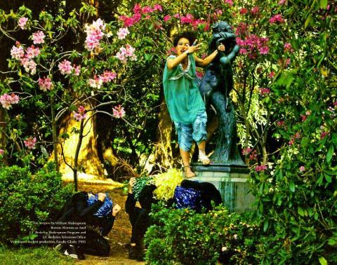 |
AuthorI am a Belmont Student taking a Digital Literacy class! Archives
November 2019
Categories |
 RSS Feed
